What’s in a word? Turns out, a lot.
How UX writing improved Logitech’s navigation to drive desired user action.
What I did
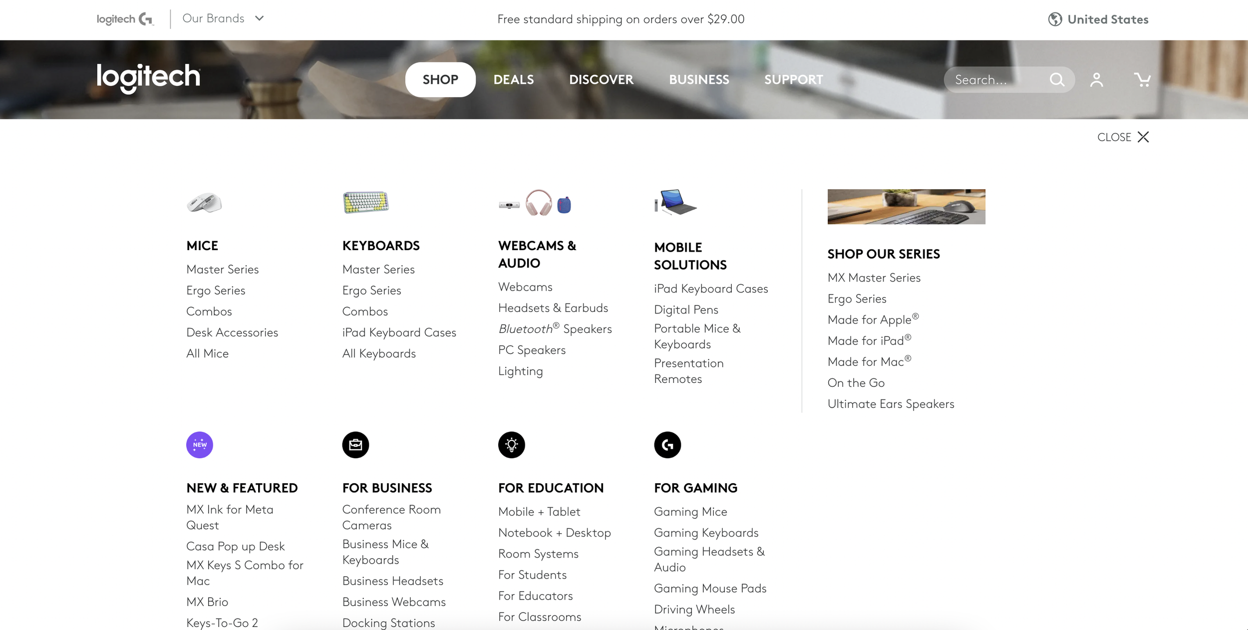
Logitech Navigation Refresh
Role: Content strategy, UX writing
Company: Logitech
Year: 2021
Problem
Logitech’s vision was to defy expectations through a customer-centric digital flagship that enables personalized connections to deliver an iconic brand experience. A simpler goal was to improve the website overall to increase sales and site performance.
Based on data, we had a sense that users were confused about where to shop because there were consumer, business, and gaming sections. In addition, we knew from Sales that SMBs regularly avoided the business section in favor of one-offs on the consumer site, causing a lot of missed opportunity.
Solution
I partnered with our Research Lead to gather more insights. and Information Architect to propose a cleaner navigation. I hypotheized that using the term “Shop” would help drive traffic and clicks.
Over the past quarter, we conducted a quantitative user feedback study that included 410 users (310 B2B/100 B2C) to measure how the navigation is performing in terms of findability, benchmarking against the previous navigation. Many of the tactical findings are being addressed in the next release, and we also identified key areas to focus on improving over the longer term.
Impact
High level metrics continued to trend positively post-Kepler launch on 4/1. Our secondary conversion metrics, orders & lead generation were also positive for users interacting with the global navigation, suggesting the navigation is helping our users engage and convert on the site.
Page Views increased from 4 →4.9
Time on Site increased ~ 65 seconds.
Onsite search has increased – this is not positive or negative, but a user behavior we monitor.
Orders increased by 10% YOY for users interacting w/ global navigation
Contact Sales Rate increased 112% YOY for users interacting w/ global navigation
